
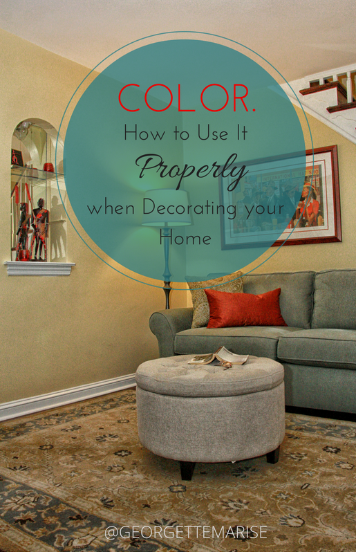
Color. How to Use it Properly when decorating your home.
Color! Some people are terrified of it and others LOVE it! Where do you fall? As an interior designer my clients require guidance on how to apply the appropriate color palette for their home. In most cases, it is common for people to feel overwhelmed when selecting colors on their own to decorate a space. Color affects your mood and your perception of a space or object.
"Let's embrace your comfort level with color and learn how to incorporate it into your home."
using color correctly. PAINT: SW 6379 JERSEY CREAM
Develop a Palette. Every space needs a color palette. A color palette is an index of all the main colors that are selected for the room. When developing a color palette first decide on which color will be the primary color in the space. I suggest compiling three to five different colors for your space. Let’s create a scenario using a color palette that consist of teal and rust. A great color to add to the palette would be a neutral color, a latte or a butter yellow to balance the two main colors.
Choosing your Colors. Ever go to a paint store to find a color to paint your room and feel lost? The good news is that you will only need 3 or 5 colors for your palette. A good exercise when deciding on colors is to find out what colors inspire you and use them in layers. A trade secret that professionals use often is selecting a primary color for the main walls, a secondary color for an accent wall, and a third color for details such as ceiling paint options.
If you are having a hard time finding inspiration flip through some decorating magazines, browse online or take a trip to a furniture showroom to get some ideas on color combinations that they use and make sure to talk to your interior designer to get a professional opinion on colors you selected for your space. If your inspiration piece has more than 5 colors, choose 3 to 5 of those colors to incorporate in your room.
Using Layers of Color. Once you have determined your color palette, you need to make sure that you have light, medium, and dark colors throughout your palette. Your colors can come from your paint, flooring, furniture, or accessories. You might have a color palette that has 5 different colors that compliment each other and has a hint of warm or cool, but if all 5 colors are the same tone or shade this creates a flat, uninteresting color palette. Even if your room were to consist of one color in order for everything in the room to not camouflage you will need to create a palette with light, medium, and dark tones.
"Making sure your palette has light, medium, and dark tones creates dimension and interest to any room."
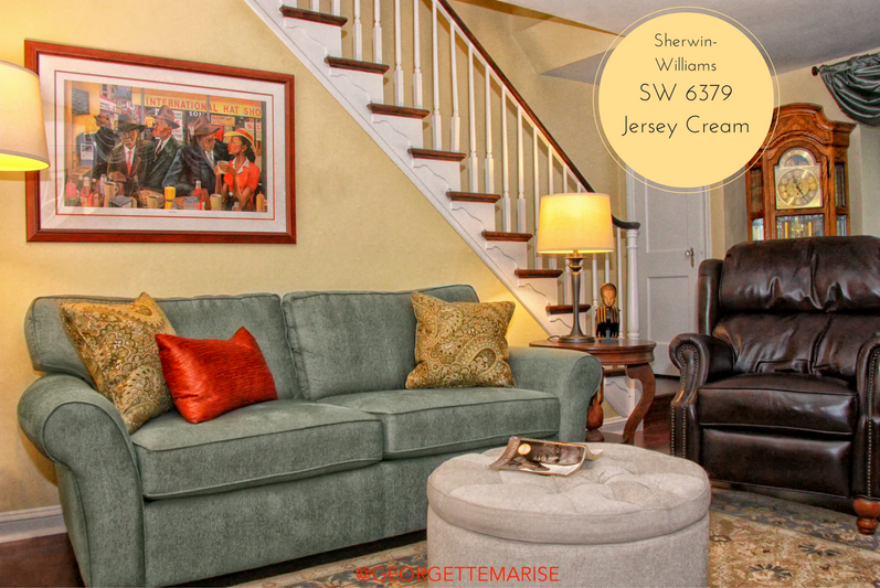
I used a mixture of light, medium and dark colors to create a well balanced color palette. Paint: SW 6379 Jersey Cream
In this townhouse living room, I used the lighter tones on the walls, ceiling, ottoman and the area rug. The medium color tones were used in the sofa, pillows and window treatments, and I used the darkest tones in the leather recliner and the wood floors.
Color is an essential piece to decorating and designing any room. It will affect how you see and feel in a room. Using the proper amount of colors creates layers of interest in a space.

USE YOUR COLOR PALETTE.
Are you still feeling stuck with what colors to use on your walls? Are you worried about making a mistake? Choose my Paint Color Suggestions service today and get hand picked color options perfect for your space. Don't forget to leave your comments below.
Here's to decorating with color!
