
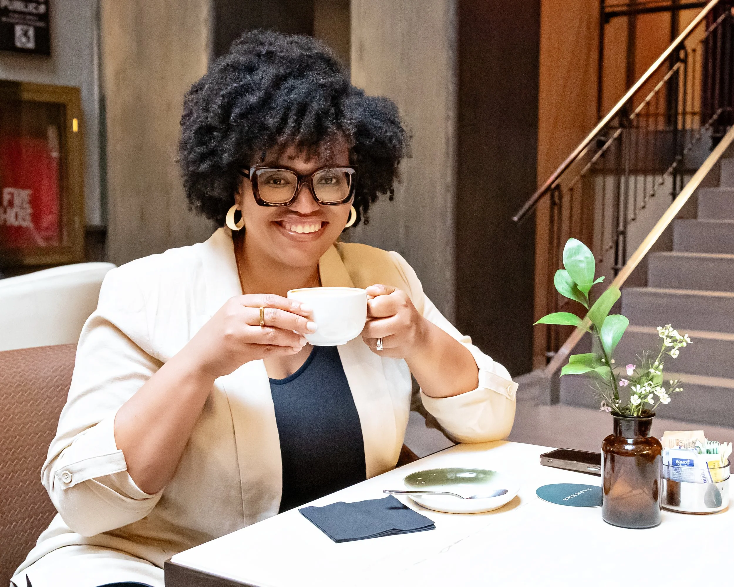
I am Sabine Guillaume Hayes, interior designer & founder of Georgette Marise Interiors. Someone who has spent over ten years believing that your home should feel like the truest version of you.
I work with homeowners across the Main Line PA, Northern Delaware, and South Jersey who are done living in spaces that almost feel right. This is where I share what I have learned. About design, the homes I have worked in, and about what it actually takes to make a home feel like it belongs to the person inside it.
Love a well-designed room? Start with a signature scent. Explore the Belfong Candle Collection inspired by legacy, created for the senses.
Need a color palette or design guide? Shop my eBooks + digital boards for instant inspiration.

A Journey of Scent, Memory, and Legacy

As I sit here, surrounded by the warm glow of Luxe Noir and Élégant, I am transported back to the beginning of this journey. It began with a simple goal: to create scents that honor the memory of my late mother and grandmother. But as the process unfolded, it became so much more—a journey of scents that stir emotions, invoke memories, and connect people to places they thought they had forgotten.
I spent hours, days, weeks, and months, sampling essential oils, testing blends, and combining notes, all in search of the perfect fragrance to capture the essence of the two women who shaped me. The process was far more than just mixing oils and balancing notes; it was a deeply personal exploration of memory and scent.
Élégant: A Window into the Past
Élégant is, in many ways, a love letter to my grandmother Georgette. Whenever I light the candle or catch the scent of the room spray, I’m back in her Midtown Manhattan apartment. I can picture it now—her bathroom cabinet lined with delicate glass bottles, each holding a piece of her daily ritual. My grandmother was a woman who loved beautiful things, especially when it came to fragrance, from classic Elizabeth Arden perfumes to Lancôme products. One bottle that always caught my eye was her Jean Naté After Bath Splash. Its notes of bergamot, lavender, musk, lemon, and jasmine filled the room with a refreshing elegance, something clean yet deeply comforting. That scent—the way it lingered in her space—has stayed with me through the years.
Creating Élégant was my way of bottling that memory: a scent that captures the freshness of bergamot and lemon, balanced by the gentle floral heart of jasmine and soft musk. It’s a scent that feels like coming home and evokes the same refined simplicity that defined my grandmother. She was always so put together, effortlessly chic but approachable and warm, and Élégant captures that balance. It’s the scent of quiet strength and elegance.

the Belfong Candle Collection. A Journey of Scent, Memory, and Legacy
Luxe Noir: A Tribute to Timeless Sophistication
Luxe Noir was inspired by a different side of my grandmother—a side of her that was sophisticated and graceful, yet had a kind, welcoming spirit. She moved through life with a sense of poise that I admired, an elegance that made an impact without needing to announce itself. Luxe Noir mirrors that spirit. It has a depth that draws you in, with earthy vetiver and musk, while the vanilla orchid adds a subtle sweetness, a nod to the kindness and approachability she always showed.
Creating this fragrance was about more than just mixing notes; it was about capturing the essence of my grandmother’s presence. Luxe Noir is a tribute to her confidence, her class, and the warmth she shared with everyone she met. It’s a scent that carries an air of mystery and depth, but it has a softness that makes it feel like a warm embrace.
A Scent Experience Beyond Just Smelling Good
What I hadn’t anticipated was how deeply these scents would resonate with others. I’ve watched clients tear up when they smell Élégant, one even telling me how it reminded them of their childhood and their father, who has since passed. Another was brought back to memories of family gatherings, times that felt warm and whole. Hearing these stories has been the most rewarding part of this journey. It confirmed what I’ve always believed: that scent is tied to emotion and memory in a way that few other senses are.
“...scent is more than a pleasant aroma; it’s a bridge to the past and a foundation for the memories we build now”
These candles, diffusers, and room sprays aren’t just products; they are portals to another time, places that are deeply personal yet universally felt. They remind us that scent is more than a pleasant aroma; it’s a bridge to the past and a foundation for the memories we build now.
Share Your Memory
I created The Belfong Candle Collection to be exclusive for a reason—each piece is crafted in small batches, making it as special and unique as the memories it evokes. I invite you to experience Luxe Noir and Élégant for yourself. What memories do they stir for you? What stories do they bring to life? I would love to hear your experience, so please share it and tag us @georgettemarise.
These scents are available only through Georgette Marise Interiors, and once they’re gone, they may not return for months. Don’t miss the chance to bring one of these exclusive pieces into your home and see where the scent takes you. Pre-order your scents HERE and join us on November 16th, 2024 as we celebrate the launch of our diffusers and room sprays! RSVP >>>Click here.


Classic & Casual: How to design a balanced space.
As many of you know Georgette Marise Interiors is named after my late grandmother Georgette Belfong and my late mother Suzanne Marise Guillaume. These women played a large role in the development of my own style and why I fell in love with design.

How to Design a balanced space.
Just to give you a little history...my late grandmother Georgette lived in Manhattan during her later years and lived a metropolitan lifestyle. She had an appreciation for timeless decor, classical music and tailored fashion. Being from the Caribbean she spoke fluent French, loved to travel and enjoyed hosting formal dinner parties in her New York apartment. Her style was focused around fine details.

Georgette is the classic part of the georgette marise style.
My late mother Suzanne Marise, also from the Caribbean, lived both a metropolitan and suburban lifestyle. Her view on style was very casual and simplistic yet sophisticated. Everything she owned was functional and held up to everyday use. Unlike my grandmother, she enjoyed hosting casual (less formal) dinner parties.

marisE IS THE casual PART OF THE GEORGETTE MARISE STYLE.
Together Georgette & Marise inspired me to develop my own style. As an interior designer, I have an appreciation for a variety of design periods used in the proper manner. I believe design is personal, functional and stylish. Good design should be a reflection of your personality. Georgette & Marise had two different personalities, which I've always admired. As an adult and now mother I have developed a classic & casual style that works with my overall lifestyle.

start with these 3 steps to achieve a balanced designed space.
What is your style? Are you classic, casual or both? Share your style in the comments below, I'd love to know!
A well balanced space is able to be functional and stylish with a mixture of classic & casual decor. Contact me today at 610.924.2780 to find out how you can have your personality reflected in your space.
Here's to creating classic & casual spaces!

3 Dramatic Paint Colors for your Powder Room that will Impress Guests
As a designer I always guide my clients when it comes to selecting paint colors. It’s a big decision! Picking the wrong color can ruin the design of a room. There’s usually one room in the house that will allow you to be bolder than usual…the Powder Room! A powder room is a small room for guests to freshen up privately.
Even if you have an open concept home, your powder room can have a slight edge to the overall design of your home because it’s a room of its own. These are some dramatic paint colors that will have your holiday dinner guests saying “Wow, that’s nice! What is that paint color?”
1. Moody Blue by Sherwin Williams
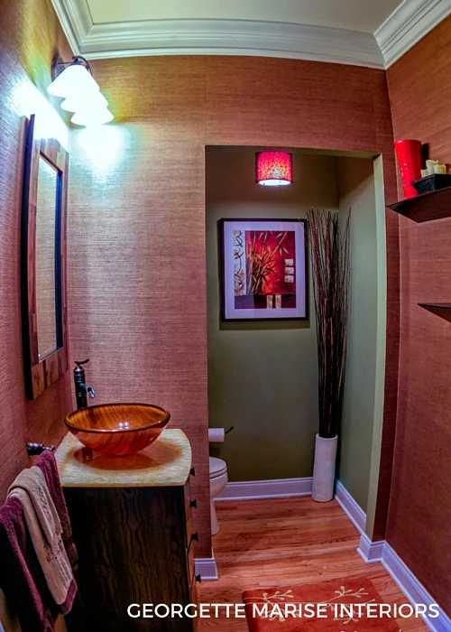
If you are looking for a deep yet relaxing color for your powder room than Moody Blue is a great option. It's a cool tone that pairs well with a mixture of finishes. In this powder room we drew the paint color from the accented blue in the chocolate towels. That allowed us to add some bronze and gold from the accessories to balance the Moody Blue walls.
Sherwin Williams SW6221 Moody Blue
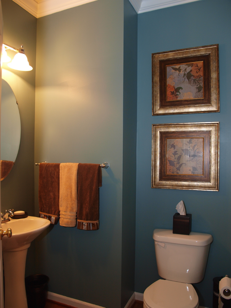
2. Dovetail by Sherwin Williams
Dovetail is a great paint color option if you are looking to achieve an urban or transitional style powder room. It's a rich gray that pairs nicely with lighter tones and bright accents. In this powder room we complimented the gray with orange orchids, rust colored towels, and a white/ivory mother of pearl mirror.
Sherwin Williams SW7018 Dovetail
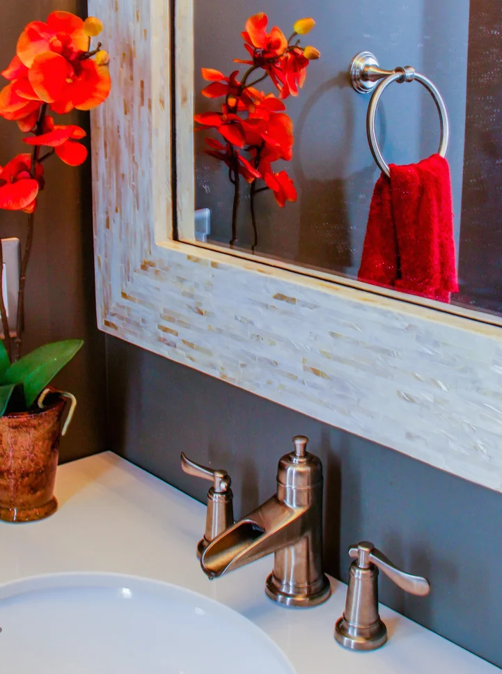
3. Expressive Plum by Sherwin Williams
Expressive Plum is a deep violet with a hue of gray, a cool blue, and a small hint of red. It is a great option in a traditional or transitional style powder room. It pairs nicely with white fixtures and chrome hardware to add a classic look. This color pairs well with warm grays, blues, rustic orange, or fiery red accents.

sherwin williams sw6271 expressive plum
With these options you are sure to impress your guests!

Still feeling overwhelmed? Need help picking out the perfect color for your space? No worries, purchase our Paint Color Suggestions TODAY to get your project started! Click here.