Pantone’s 2026 Color of the Year Is White…Here’s Why Designers Are Divided
A professional interior designer’s perspective on Cloud Dancer, color psychology, and cultural fatigue.
When Pantone announced Cloud Dancer, a soft white, as the 2026 Color of the Year, the design world reacted instantly. Some people were confused. Others joked that it looked like a “landlord special.” And some even tied the choice to the cultural and political climate.
While all of that commentary is interesting, I want to offer a different perspective — not political, not reactionary — but from the lens of a professional interior designer who lives and breathes color.
Let me start here:
I understand what white does. I respect its place. I just don’t believe it should be crowned the lead character of 2026.
And that distinction matters.
What Pantone Says Cloud Dancer Represents
Image courtesy of Pantone®
Pantone describes Cloud Dancer as a color that reflects:
Lightness
Simplicity
Calm
A desire for quiet and clarity in an overstimulated world
From a color psychology standpoint, white is associated with cleanliness, openness, renewal, and mental clarity. In a season of visual and emotional overload, a collective craving for calm makes complete sense. From that perspective, Pantone’s choice is logical.
But in design, logic and inspiration are not always the same thing.
My Honest Reaction as an Interior Designer
With a trained eye that studies undertones, saturation, contrast, and harmony every single day, my response was simple: I felt underwhelmed.
Not offended.
Not angry.
Just… uninspired.
We’ve already lived through:
All-white kitchens
All-white sofas
Layered whites on whites on whites
Neutral minimalism dominating interiors for years
White has been the backdrop of nearly every major design trend of the last decade. So when I heard “Color of the Year” and then saw white, it felt less like a bold declaration and more like the absence of one.
This particular shade, Cloud Dancer, feels:
Sterile
Flat
Void
Almost like the removal of color rather than a celebration of it
That emotional pause is what made me reflect more deeply on what Color of the Year is really meant to represent.
The Role of White vs. the Role of a Lead Color in Interior Design
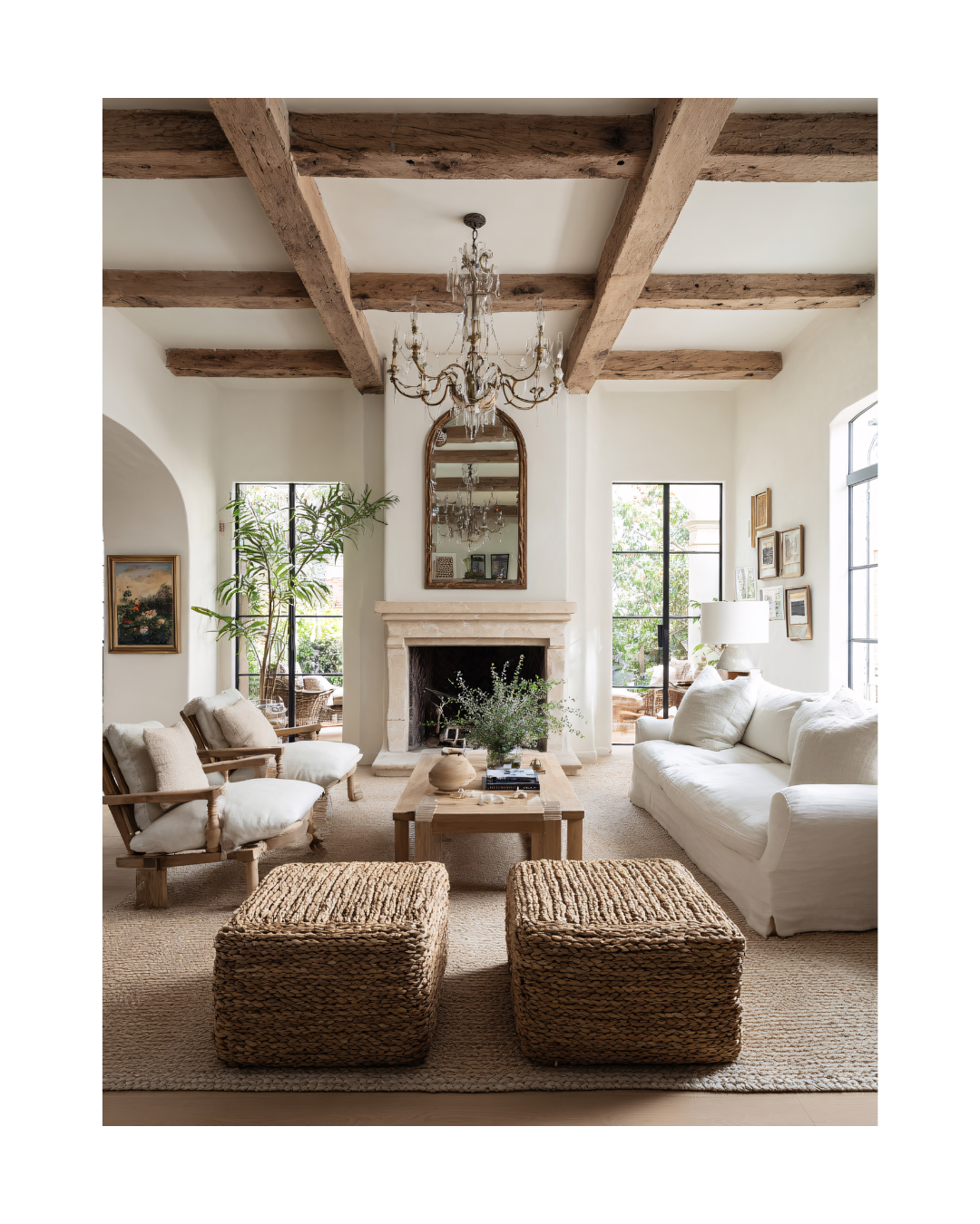
White is powerful but its power has always been in what it supports, not what it replaces.
White:
Gives the eye space to rest
Allows other colors to shine
Creates balance and contrast
Acts as a visual transition
Frames beauty rather than becoming the main subject
White is the pause between chapters in a book - necessary and peaceful, but not the chapter itself.
As a stand-alone “Color of the Year,” it feels like placing the spotlight on the background. And for a title that historically pushes creativity forward, this feels like a missed opportunity.
Why Color Matters So Much to Me
I don’t just see color as décor.
I see color as language.
Color is personal.
Color is cultural.
Color is emotional.
Color is memory.
My love for color was shaped by contrast - by movement between worlds.
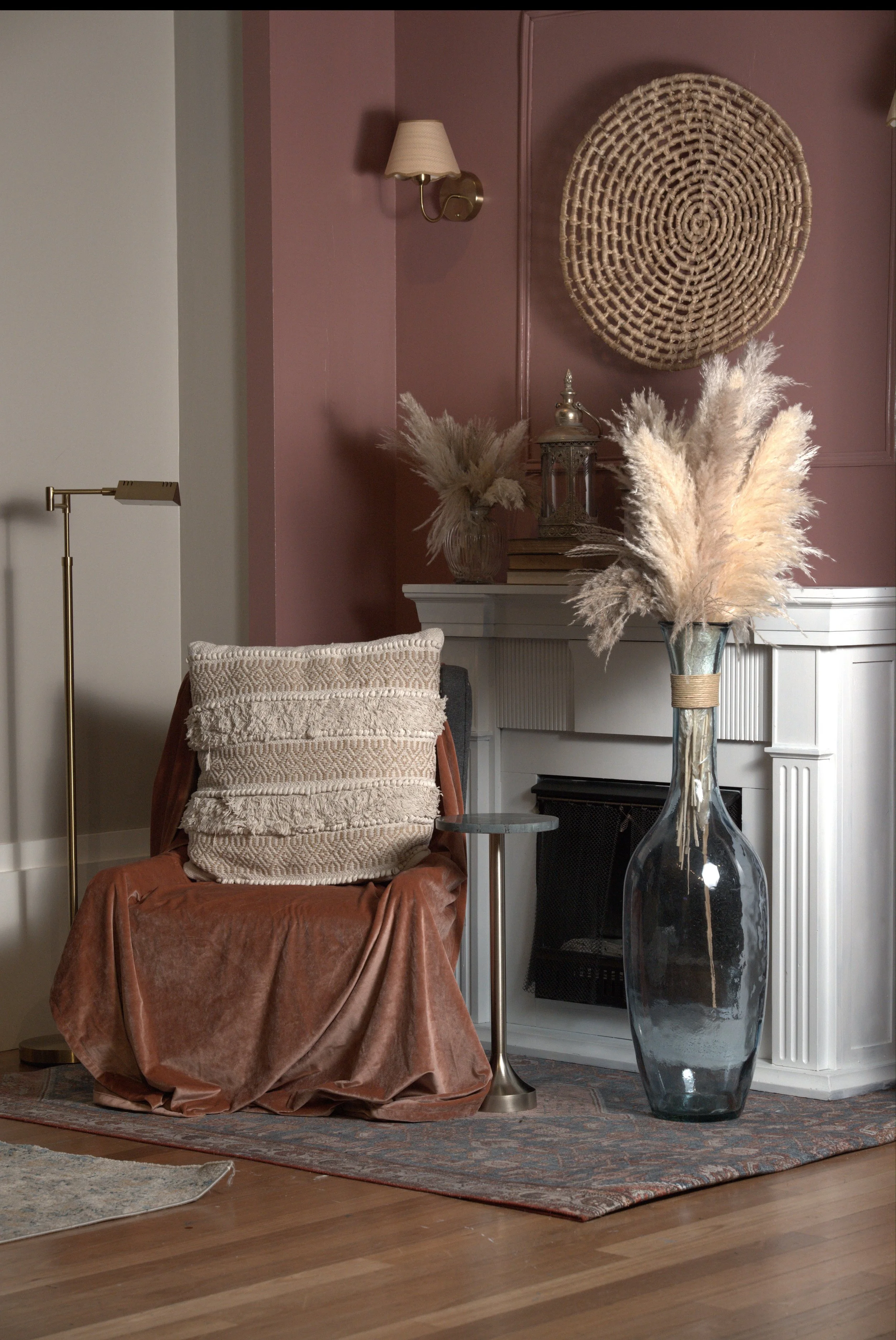
On one hand, my heart lives in tropical, Bohemian design. I’m endlessly inspired by the Caribbean islands (my mother’s homeland) the richness of palm trees, the drama of banana leaves, the way greens layer into one another as sunlight filters through them. The Caribbean is never flat. It is saturated, alive, and layered with warmth and rhythm.
Georgette Marise Interiors vignette
On the other hand, I am a city girl at my core. I was born in Queens, New York and often spent time visiting my grandmother in her Manhattan home. The city sharpened my eye through Art Deco geometry, Art Nouveau curves, bold architectural ornamentation, metallic finishes, and contrast. New York taught me that color can be dramatic and commanding, even when restrained.
Between the tropics and the city, my design language was formed:
Lush yet intentional
Expressive yet structured
Bold yet balanced
Emotional yet refined
Nature remains my greatest teacher. The sky never shows up as one blue. The ocean never offers a single tone. Sunsets arrive layered, glowing, complex, and imperfect. I see nature’s palette as a gift, one we’re meant to experience with both our eyes and our bodies.
White isn’t where the story begins.
It’s where one chapter ends so another can start.
Interior Design Trends, Timelessness, and Color Fatigue
As an interior designer, I respect all styles - even the ones that don’t personally resonate with me. Minimalism has a place. Neutrals have their elegance. Restraint can be beautiful.
But Color of the Year is not about safety.
It’s about direction.
It’s meant to:
Spark creativity
Signal cultural movement
Influence interiors, fashion, branding, and art
Invite us into something new
Choosing white feels more reflective than forward-looking.
Right now, many homeowners are craving:
Warmth
Expression
Depth
Personality
Life
Not just quiet.
My Professional Take on Pantone’s 2026 Color of the Year
Cloud Dancer isn’t wrong.
It’s just not bold.
It isn’t layered.
It isn’t emotionally complex.
It isn’t pushing the visual conversation forward.
I respect what white does.
I respect its place in interior design.
I use white constantly in my work.
I just don’t believe it should be the lead character of 2026.
For me, white will always be the supporting act that elevates the true stars of a color palette - not the star itself.
Ready to Create a Color Palette That Feels Like You?
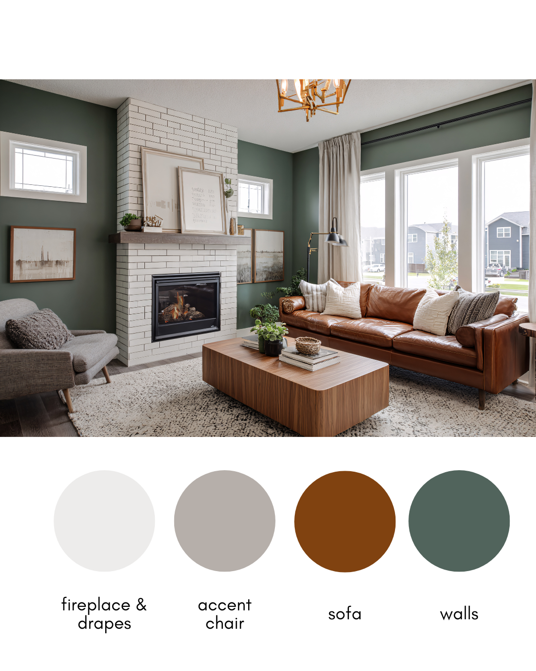
If this conversation has you rethinking the role color plays in your home, you don’t have to navigate that shift alone. If you’re ready to move beyond trend-driven choices and into a color palette that truly reflects you, I offer a personalized e-Design Paint Color Suggestion Service designed to remove the guesswork and replace it with clarity and confidence.
Together, we’ll create a color direction that feels intentional, layered, and aligned with how you actually live in your space.
To learn more and get your personalized Paint Color Palette CLICK HERE.


